CRM
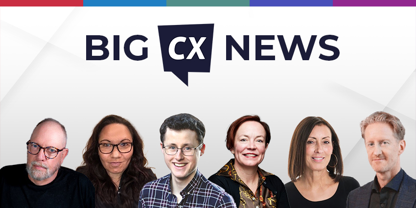
Big CX News from Salesforce, HubSpot, SAP, & Medallia
Data & Analytics
Salesforce Launches Zero Copy Partner Network to Improve Tech Integrations
Voice of the Customer
Medallia Confirms CEO Joe Tyrrell Has Stepped Down
HubSpot Declares “Customer Experience Is Broken”, Unveils the “All-New” Service Hub to Fix It
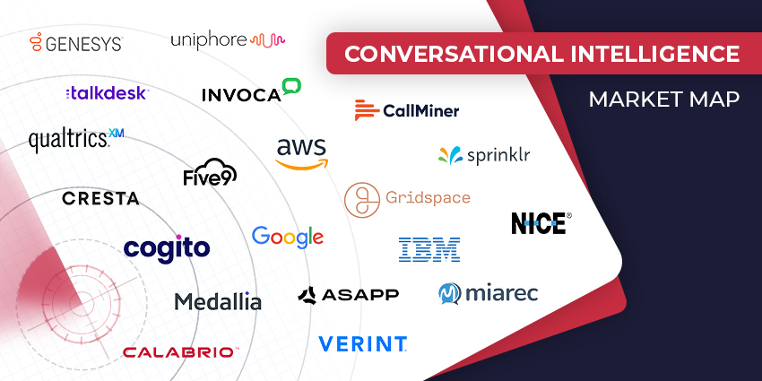
Speech Analytics
The Top Conversational Intelligence Vendors for 2024
Contact Centre
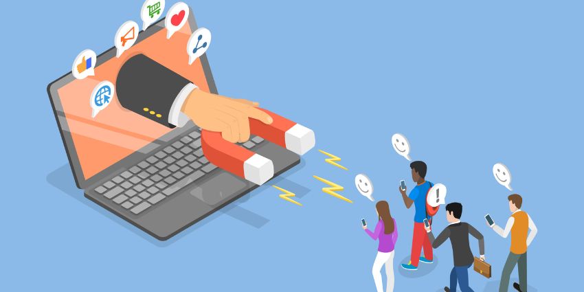
Unlocking Customer Potential: Customer Lifetime Value Definition, Formula, and Best Practices
Overworked and Under Paid: Call Center Industry the Weakest Job Market in the UK
Loyalty Management
Sunshine Service: Embracing Positivity in Customer Interactions
CX TV
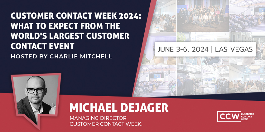
Customer Contact Week 2024: What to Expect from the World’s Largest Customer Contact Event
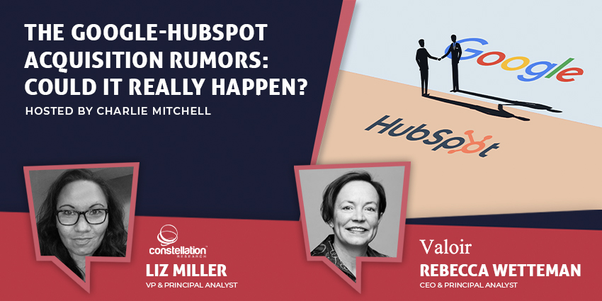
The Google-HubSpot Acquisition Rumors: Could It Really Happen?
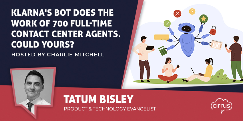
Klarna’s Bot Does the Work of 700 Full-Time Contact Center Agents. Could Yours?
BIG CX News – Enterprise Connect 2024: The Roundup ft. Five9, Cisco, Salesforce & More
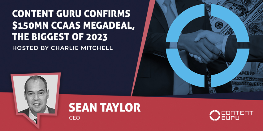
Content Guru Confirms $150MN CCaaS Megadeal, the Biggest of 2023