WFO
The Net Promoter Score 2.0? evaluagent Releases an Expected NPS Score
CRM
HubSpot Declares “Customer Experience Is Broken”, Unveils the “All-New” Service Hub to Fix It
Salesforce Backs Out of Informatica Deal, Reports
Speech Analytics
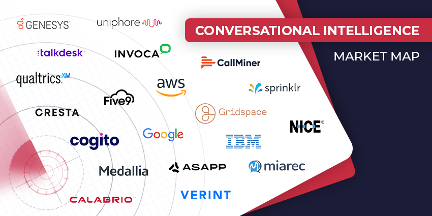
The Top Conversational Intelligence Vendors for 2024
Loyalty Management
Politeness Pays Off: Boosting Customer Experience with Courtesy
HubSpot “Reinvents” Content Marketing, Takes Commerce Hub Global
Contact Centre
The Modern Contact Center Stack: What Does It Look Like?
Faster, Smarter, Better: 8 Contact Center Efficiency Boosters
CX TV
Customer Contact Week 2024: What to Expect from the World’s Largest Customer Contact Event
The Google-HubSpot Acquisition Rumors: Could It Really Happen?
Klarna’s Bot Does the Work of 700 Full-Time Contact Center Agents. Could Yours?
BIG CX News – Enterprise Connect 2024: The Roundup ft. Five9, Cisco, Salesforce & More
Content Guru Confirms $150MN CCaaS Megadeal, the Biggest of 2023