CRM
CPaaS Platforms: Trends, Industries, and Differentiators
Big CX News From Salesforce, Microsoft, Zendesk, & Vonage
Informatica Co-Founder: The Salesforce Acquisition Is “a Bad Idea”
Contact Centre
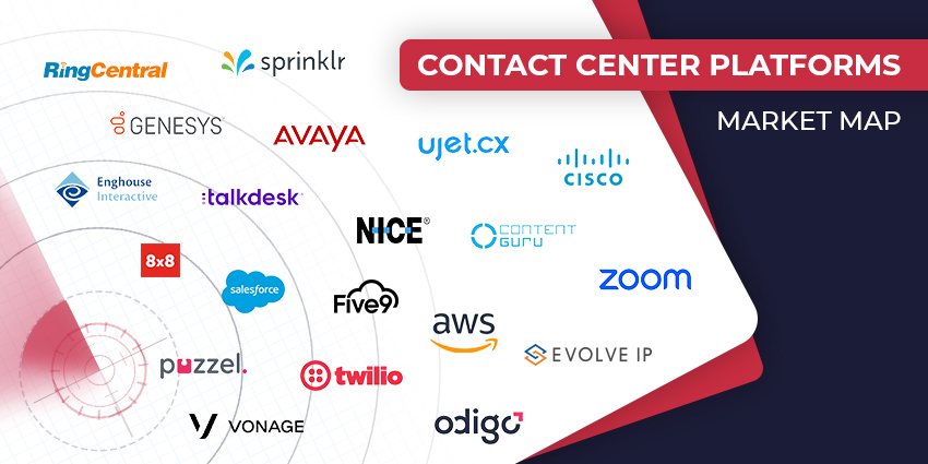
The Top Contact Center Vendors to Consider in 2024
CRM Excellence Unleashed: The Ultimate Guide on How to Use CRM Effectively
Mastery in Motion: Defining Process Knowledge with Examples and Best Practices
Loyalty Management
How to Handle Difficult Customers? 10 Strategies for Navigating the Storm
Voice of the Customer
Almost Half of Consumers Feel Customer Service Has Worsened Over Past 3 Years
CX TV
Customer Contact Week 2024: What to Expect from the World’s Largest Customer Contact Event
The Google-HubSpot Acquisition Rumors: Could It Really Happen?
Klarna’s Bot Does the Work of 700 Full-Time Contact Center Agents. Could Yours?
BIG CX News – Enterprise Connect 2024: The Roundup ft. Five9, Cisco, Salesforce & More
Content Guru Confirms $150MN CCaaS Megadeal, the Biggest of 2023