WFO
Verint Showcases Its Team of Bots That Automate Contact Center Quality Management
CRM
SAP Shares “Workforce Transformation” Update After Employee Pushback
Salesforce Backs Out of Informatica Deal, Reports
Speech Analytics
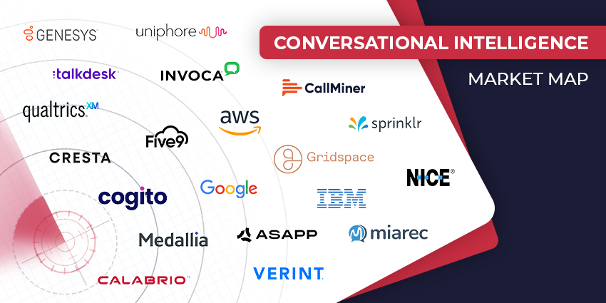
The Top Conversational Intelligence Vendors for 2024
Calabrio Confirms CEO Exit, Releases New QA Tools
Text Analytics
SMS Vulnerabilities: Weaknesses That Consumers & Enterprises Must Be Aware Of
Contact Centre
Omnichannel Contact Center: The Hot Trends of 2024
CRM Excellence Unleashed: The Ultimate Guide on How to Use CRM Effectively
CX TV
Customer Contact Week 2024: What to Expect from the World’s Largest Customer Contact Event
The Google-HubSpot Acquisition Rumors: Could It Really Happen?
Klarna’s Bot Does the Work of 700 Full-Time Contact Center Agents. Could Yours?
BIG CX News – Enterprise Connect 2024: The Roundup ft. Five9, Cisco, Salesforce & More
Content Guru Confirms $150MN CCaaS Megadeal, the Biggest of 2023